alternative
  • Home (current)
  • About
  • Tutorial
    Technologies
    C#
    Deep Learning
    Statistics for AIML
    Natural Language Processing
    Machine Learning
    SQL -Structured Query Language
    Python
    Ethical Hacking
    Placement Preparation
    Quantitative Aptitude
    View All Tutorial
  • Quiz
    C#
    SQL -Structured Query Language
    Quantitative Aptitude
    Java
    View All Quiz Course
  • Q & A
    C#
    Quantitative Aptitude
    Java
    View All Q & A course
  • Programs
  • Articles
    Identity And Access Management
    Artificial Intelligence & Machine Learning Project
    How to publish your local website on github pages with a custom domain name?
    How to download and install Xampp on Window Operating System ?
    How To Download And Install MySql Workbench
    How to install Pycharm ?
    How to install Python ?
    How to download and install Visual Studio IDE taking an example of C# (C Sharp)
    View All Post
  • Tools
    Program Compiler
    Sql Compiler
    Replace Multiple Text
    Meta Data From Multiple Url
  • Contact
  • User
    Login
    Register

Statistics for AIML - Descriptive statistics - QQ-Plot Tutorial

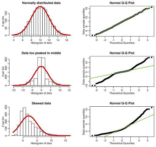
The quantile-quantile (q-q) plot is a graphical technique for determining if two data sets come from populations with a common distribution.

A q-q plot is a plot of the quantiles of the first data set against the quantiles of the second data set. By a quantile, we mean the fraction (or percent) of points below the given value. That is, the 0.3 (or 30%) quantile is the point at which 30% percent of the data fall below and 70% fall above that value.

A 45-degree reference line is also plotted. If the two sets come from a population with the same distribution, the points should fall approximately along this reference line. The greater the departure from this reference line, the greater the evidence for the conclusion that the two data sets have come from populations with different distributions.

sample quantile-quantile plot

This q-q plot of the JAHANMI2.DAT data set shows that

These 2 batches do not appear to have come from populations with a common distribution.

The batch 1 values are significantly higher than the corresponding batch 2 values.

The differences are increasing from values 525 to 625. Then the values for the 2 batches get closer again.


https://miro.medium.com/max/512/1*_wuWDNGs3hB2K0_kgpoc1A.jpeg

Statistics for AIML

Statistics for AIML

  • Introduction
  • Data Visualization
    • Overview
  • Descriptive statistics
    • Overview
    • Calculate Z Score
    • Covariance and Covariance matrix
    • Covariance vs. Correlation
    • QQ-Plot
    • Central Limit Theorem
  • Inferential Statistics
    • Overview
    • Hypothesis Testing
    • Statistical Test and there types
    • Bias Variance Trade Off
  • Regression Metrics
    • Overview
    • Accuracy
    • PR Curve (Precision-Recall Curve)
    • AUC-ROC Curve
    • Different types of Sampling
    • Skewness
    • Kurtosis
    • Degree Of freedom
    • Different Types Of Probability Distribution
    • Outlier
    • Bayes Theorem
    • Probability

About Fresherbell

Best learning portal that provides you great learning experience of various technologies with modern compilation tools and technique

Important Links

Don't hesitate to give us a call or send us a contact form message

Terms & Conditions
Privacy Policy
Contact Us

Social Media

© Untitled. All rights reserved. Demo Images: Unsplash. Design: HTML5 UP.

Toggle